

Warm white creates a classic, softer look, cool white creates a brighter, crisper look, and multicolor brings more color and contrast to the display. The right Christmas lighting palette depends on your home’s exterior, the look you want to create, and whether you’re using one color throughout or combining colors intentionally.
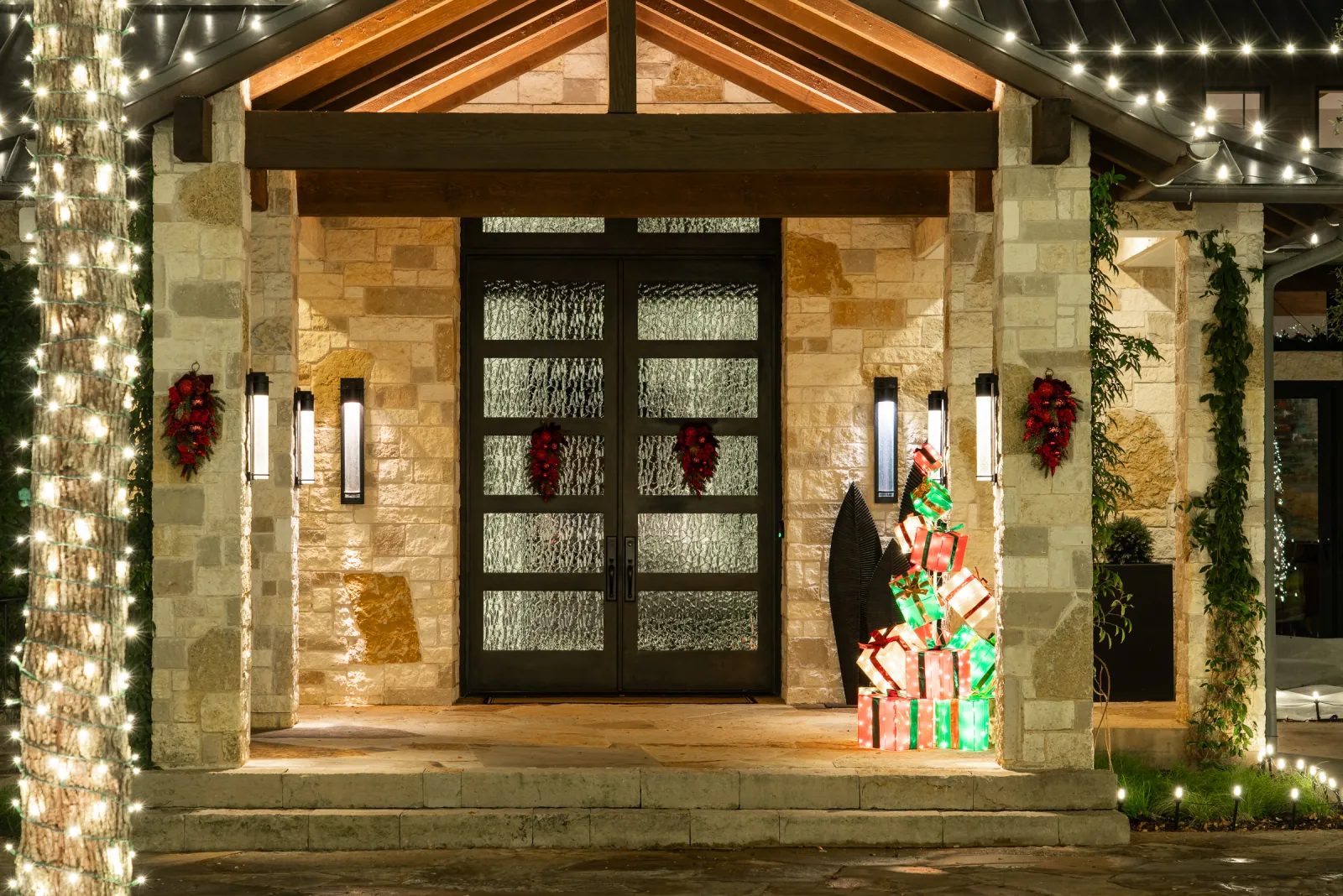
What each color option actually looks like at night
Warm white has a softer, slightly golden appearance that most closely resembles traditional incandescent Christmas lights. It tends to create a classic, understated look.
Cool white appears brighter and more blue-white. The contrast is sharper, which can give a display a cleaner, more contemporary appearance.
Multicolor creates a completely different effect because color becomes part of the design itself. Rather than using light primarily to trace the home’s architecture, the palette becomes one of the things your eye notices first.
None of the three is objectively better. The right pick depends on what a homeowner wants the display to feel like: a quieter, more classic look that reads well year after year, or something bolder and more expressive.
Matching color to your home’s architecture
Color temperature interacts directly with your home’s exterior materials. Warm white tends to flatter red brick, warm-toned stone, and traditional trim, deepening those colors rather than washing them out. Cool white reads especially well against lighter stucco, gray or white exteriors, and more contemporary architecture, where the cleaner light matches the home’s overall lines.
This is one of the clearest reasons a stock lighting kit and a designed look can produce such different results on the same street. The same string of lights that looks sharp on a modern gray exterior can look stark and cold on a traditional brick colonial two doors down, and vice versa.
Landscaping plays a role too. Homes with mature trees and darker foliage tend to hold warm white well, since the contrast against the greenery reads naturally. A more manicured, hardscape-heavy front yard can carry cool white without looking sterile, since there’s less warm-toned material nearby to clash with it.
Should your Christmas lights match your neighborhood?
Your own street can also be useful context. Some homeowners want their display to feel consistent with the surrounding homes, while others intentionally want something different. Looking at how nearby properties decorate can help you decide whether you want your home to blend into an established holiday look or stand apart from it. In neighborhoods known for elaborate seasonal displays, a bolder or multicolor palette may feel completely at home.
If your community has specific rules about holiday lighting, brightness, or timing, those are worth confirming directly with your HOA before your design is finalized, since requirements vary by community and change over time.
Mixing tones without it looking chaotic
Combining color temperatures on one property is possible, and often effective, but it takes intention. A common approach is warm white along the roofline for a classic base look, with cool white or color accents reserved for specific features, a tree, an entryway, or a particular architectural detail worth calling out. Mixing tones randomly across the same continuous line can be harder to make look intentional. A roofline that shifts between warm and cool without a clear pattern may read as inconsistent rather than designed that way on purpose.
The safest rule of thumb: pick one dominant tone for the bulk of the display, then use a second tone or color sparingly, as an accent rather than an equal partner.
The same principle applies to multicolor. A full-property multicolor display is a real, cohesive choice. A roofline that’s mostly warm white with one isolated multicolor section can look accidental rather than intentional. If multiple colors are going to share the same property, repetition and placement help make the combination read as part of one design.
Warm white vs. cool white: which is better?
Neither is inherently better. Warm white is generally the better fit when the goal is a softer, more traditional look, while cool white works when the homeowner wants a brighter, crisper effect. The better choice for a specific home depends on its exterior materials, architecture, surrounding landscaping, and the overall look the homeowner wants to create.
And if neither feels right, multicolor isn’t a compromise. It’s a different design direction altogether.
How this gets decided in your design consultation
Color is part of the same walkthrough that shapes the rest of a custom Christmas lighting design. If a homeowner already knows they want warm white, cool white, or multicolor, the designer can build around that preference. If they aren’t sure, the home’s exterior materials, architecture, landscaping, viewing angles, and the mood they want to create give the designer a starting point for a recommendation.
The Perfect Light helps homeowners make these design decisions for Christmas lighting projects across Houston, Dallas-Fort Worth, Austin, and San Antonio.
For more on how palette fits into the full plan, see how professional Christmas lighting is designed for your home and our full-service Christmas lighting program.
Not sure which palette fits your home? A design consultation is the right place to decide.
Frequently asked questions
Can I change my Christmas light color from year to year?
Yes, but changing colors may require new materials depending on the design and the lights you already own. Because The Perfect Light stores and reinstalls your existing materials each season, a major palette change should be discussed before the next installation so the team can determine what can be reused and what would need to change.
Does color choice affect the cost?
Color temperature itself generally doesn’t change pricing, since warm white, cool white, and multicolor materials are priced comparably. What can affect cost is a more complex mixed-color design that requires additional materials or more intricate installation.
Do warm white and cool white Christmas lights look different from the street?
Yes. Warm white has a softer, more golden appearance, while cool white appears brighter and more blue-white. The difference becomes especially noticeable when the two are placed near each other, which is why a lighting design should use color temperature intentionally rather than mixing tones accidentally.
Can you mix warm white and multicolor Christmas lights?
Yes. Warm white and multicolor can work together when each has a defined role in the design. For example, one color might establish the main roofline while another is used on trees or a specific feature. Repeating the palette intentionally usually creates a more cohesive result than changing colors randomly from one section to another.